|
Memories (Page 4)
Click on the thumbnails to
view the layouts in full-size. They are now arranged in reverse chronological
order.
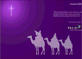 |
version Immanuel 2000.
This is the Christmas 2000
layout. It is a very quick and simple design. The main theme
of this layout is the real meaning of Christmas. It is not about
giving gifts, not about partying. It is about the best news to the
world, the Saviour is born. When you click on "Immanuel 2000", a
intro window would pop up and you'll see the Christmas message and the
navigation menu. The links on the menu would make another pop-up
window for the content. It is a lot of pop-ups, but I just didn't
feel like to pull the links on the front page. |
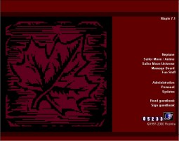 |
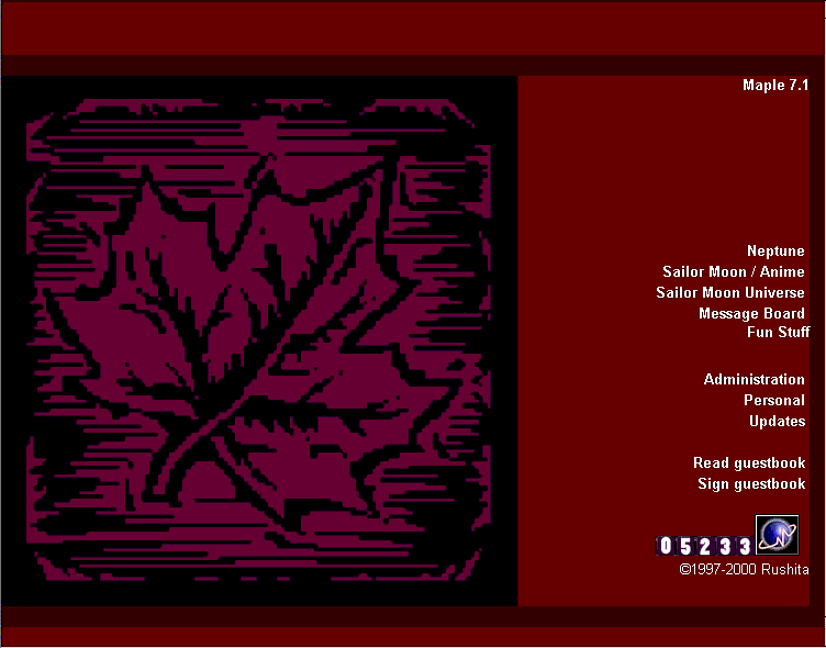
version Maple7.1, Happy
Canada Day 2000
This is a variation of the
previous layout Kakumei6.27. Same design and html, just a different
picture on the left. Like the current layout, "Maple7.1" on the top
right corner is clickable, and will open up a tiny window to explain the
layout and a bit of personal message ^^. The tiny window also lead
to download a mov file for the Molson-I am Canadian ad. An excellent
Canadian Ad. The maple leaf on the left was also sliced into 4 sections.
If you mouse over different sections, they give you different words for
one whole message, "I...am...Canadian!" |
 |
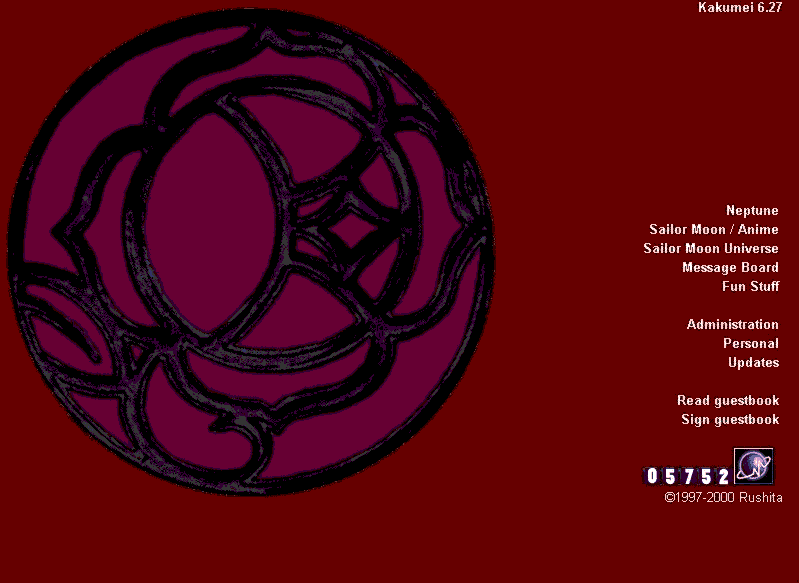
version Kakumei6.27.
I've been so overwhelmed by Shoujo Kakumei Utena lately that you can see
I've got a few SKU theme layouts ^^.
The rosecrest is the main
theme and the picture is sliced into 7 pieces in a spiral fashion symbolizing
the turning and turning around. Rotation seems to be somehow something
significant in SKU. And you mouseover each piece, you'll see a bible
quote from Ecclesiastes about things running in circle and there is nothing
new under the sun. It matches the "mystical" mood of SKU well.
When you click on "Kakumei6.27", it opens up a small window as the introduction
and shows you the secret of the rosecrest if you have missed it. |
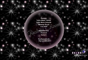 |
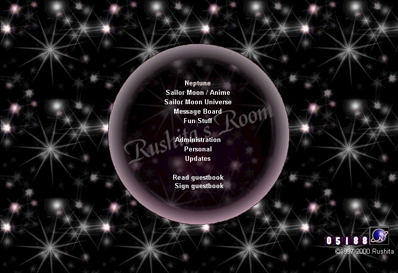
v00.05.13 Inspired by Chibi
Chibi's black and white pictures and other webpages with black and white
designs, I decided to make a black and white layout myself. At the
end, it ended up having a bit of red besides black and white. I prefer
very simple designs recently. The circle in the middle was supposed
to be like a glass ball with the text inside. I'm not sure how you
would interpret the circle ^^;;
I have seen another webpage
with a similar circle design, which was a coincident. My layout is
definitely original design ^^. |
 |
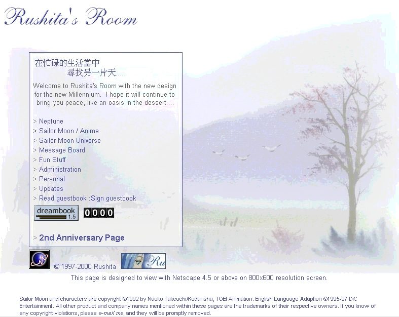
The first layout after Rushita's
Room is moved to indiko.com. Simple and quick design using the single
background full screen picture. The background picture came from
the same collection CD as the previous layout. This layout looks
fine even in 1024 pixel screen width. Although the background
picture is big, the size is reduced to about 60K to improve loading speed. |
 |
January version. (There
was a Christmas version, but the files are already deleted). This
is the last layout in Geocities.
Again extensive picture
slicing and arranging. Part of the picture is arranged as the background
of the table so text can be type on top of it. The background picture
came from the Chinese scenery drawings CD-Rom that I bought. Since
I've paid for those copyright free pictures, I might as well make use of
them ^^. Still using the same purple and white color scheme and tranquility
mood. |
 |
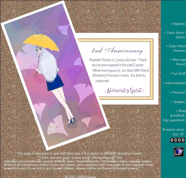
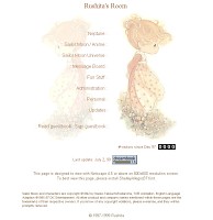
2nd Anniversary special
layout made in Nov, 99.
A different mood for the
page. The picture of Rushita on the left side is also specially drawn
for the anniversary. Starting from this layout, complicated table
and picture slicing technique has been applied to front page layouts. |
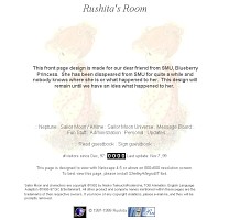 |
v.99.09.29 (you can tell
my numbering system is not quite consistent ^^;;) This is a special layout
with a special message for the missing Blueberry princess. Due to
extremely worry about what might have happened to my SMU friend BBP, I
made this very plain layout to show my worry and wished she would come
back soon.
I've used the same girl as
I did on the previous unused layout because I thought that girl matches
Blueberry princess very much. |
 |
This is version 3.3 made
on July 3, 99. This layout has not been used online. It is made right
before the previous one using a different color scheme, but basically the
same idea. The little girl is from Precious Moment. After I've made
the one with Michiru and Haruka, I decided to use that one instead and
planned to save this one for later use. However, because I ended
up using the same picture for the next layout, this layout has never actually
been used. |
 |
Most of Rushita's Room old
layouts are in a tranquility mood. I have used the purple and white
color scheme for the longest time with different layout as I have a special
interest in this color scheme ^^. Most of the sections in Rushita's
Room is still in this color scheme.
This is the v17.07.99 featuring
Michiru and Haruka. Those 2 Michiru and Haruka pictures are 2 gorgeous
separate pictures you see on the net. However, they obviously belong
to one big picture when it was drawn. Michiru and Haruka are meant
to be together, but I'll never see these 2 pictures put together ;_;
Therefore I purposely arrange them together on the layout. Ahh...Michiru
and Haruka are finally together in the park ^^ |
<< Page 1
>> << Page 2 >> << Page
3 >>
|