|
Memories (Page 3)
Click on the thumbnails to
view the layouts in full-size. They are now arranged in reverse chronological
order.
 |
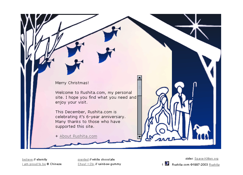
Christmas 2003 - Traditional
nativity Christmas scene. The main message used the lyrics of the
Christmas song, "Mary's Boy Child", to tell the Christmas story.
Javascript image flip is used on the angels for navigation and both mouseover
tooltips and alt text are used to display hidden bible verses messages.
The scrolling text used a combination of ilayers and javascript to make
it functional on all browsers. This is not my favourite layout, but
nevertheless, got the main component done and the message across. |
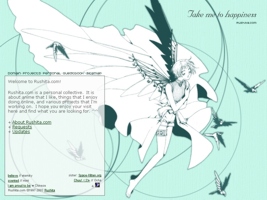 |
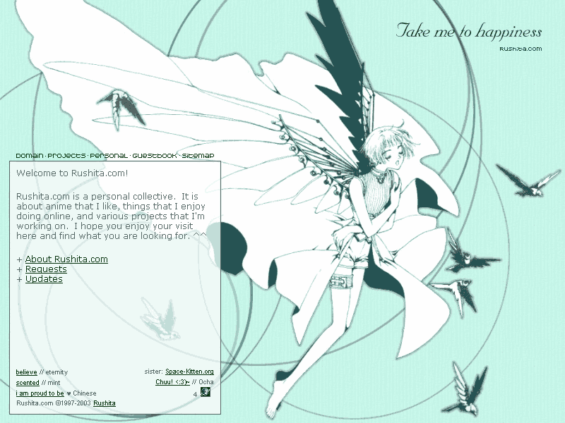
Take Me to Happiness - The
layout on second half of 2003. This is an image I scanned from my
Clover manga. I like Suu and her wings, so I decided to cropped out
her image and the birdies to make a wallpaper
out of it. The wallpaper soon turned into this layout.
The layout is designed for min. 800px width with extra fill-in background
image on the right side for bigger screen. However, since the navigation
is on the left side (to stay away from the pretty picture), the layout
seems to be tilted on the left when it is viewed on bigger screem.
The matching wallpaper is more evenly distribuited without the site text
and the consideration of flexible screen width. The background colour
wasn't supposed to be as minty on the original file, but somehow it shows
up a slightly different colour on the web. Again, the site
pages were redone with matching heading images and also matching message
board theme. The error 404 image was a hand-drawn 4 leaf clover with
barcode text to match the style of the manga. |
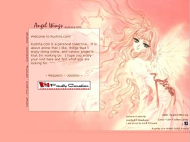 |
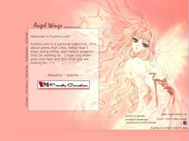
Angel Wings - The layout
on first half of 2003. This is an image from X. I wasn't familiar
with the anime, but this is a pretty picture. I hand drew the ends
of her hair to restore what is missing due to the edge of the original
image. It was done so well that the resultant picture looks so complete.
The layout is designed for min. 800px width with extra fill in background
image on the left side for bigger screen. I quickly fell in love
with this layout and its colours and this is one of my top 3 most favourite
layouts. The site pages were redone with matching heading images
and also matching message board theme. I later also made a wallpaper
out of it because the image is so beautiful and so suitable for a layout.
Originally I was going to use a different blue-tone image also from X,
but that one took too much time and work to restore the image. So,
I used this one instead. The blue-tone image was used as error 404
splash image instead. |
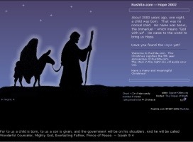 |
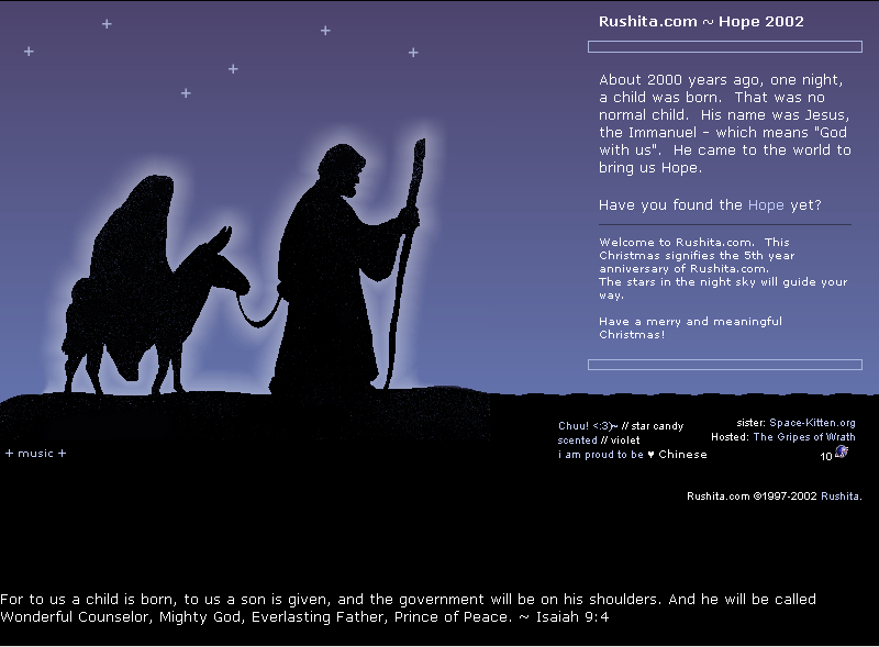
Hope 2002. The 2nd
layout on a new server. It was no longer summer and time to change
layout. Before making a normal layout, it needed to make one
for Christmas first. Again, I used simple and traditional Christmas
scene, and a Christmas message is a must ^^. I like how the blue/purple
colour changing gradually from top to bottom. To add a special touch,
I used a javascript for mouseover on the stars which are the navigation
menu. When you put your mouse over a star, it will show you what
the link is. As always, Christmas carols are needed. I picked
5 favourite Christmas carols and 5 favourite bible versus to put one of
each on each navigation page. There is also a new matching board
theme for my new xmb forum. And as always, my layouts are designed
for min. 800 px width screne but still looks right on wider screnes. |
 |
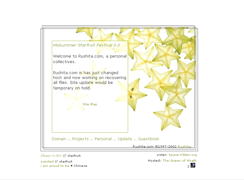
Midsummer Starfruit Festival
8.0. This layout is put up in August. I bought a CD rom with
interesting fruit pictures, so I thought it would be fun to make a totally
different layout. This starfruit layout is like ice in hot summer.
It just looks so cool and fresh. Starting from this layout, the site
is re-catergorized into different section, like a real collective site.
Site overall is more consistent in layout and the index main theme actually
applies to most pages except some that are separate section on their own.
It is a simple layout with simple navigation. Starting from this
layout, the site has a sitemap. Time to get a site map so people
don't get lost in my complicated site :p. Layout is up from August
to November 2002. |
 |
Lady of Dream, once again
I stopped using verison number for some reason ^^;; I browsed the
net to look for image for xq's blog and found this image which I liked
so much. I knew I must make a layout out of it but it is too feminine
for xq's blog and not his style. So I ended up turning it into a
layout for Rushita.com. The original image is duo tone but in purple.
I turned it into light blue and light blue looks very good on white.
This image looks a bit dreamy, so I named it "Lady of Dream", after a Hitaro
song of the same name. Again I tried to make the layout flexible
width fading the image into the blue background on the right. The
navigation is reverted back to simple icons on the left. It is still
my style to keep the layout as simple and clean as possible. This
layout was used from April to August 2002. |
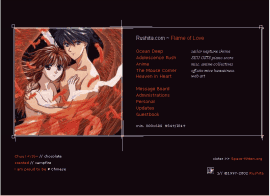 |
Flame of Love, a Fushigi
Yuugi layout. This is the one I used for the 2nd half of 2001 and
1st quarter of 2002, before and after the Christmas layout. Still
very much like Miaka, Tamahome and Suzaku, this was made about the same
time the Suzaku wallpaper was done. This layout has a flexible white
border that will extent according to the browser window width. It
is desiged for 800 pixels and above width. This is one of my most
favourite layout. I love the orange-firey-red colour on the image
and the text. It goes with black background so well. And this
time the links are done by text with description on the side too, so no
more complaint can't navigate the site! ^^ Starting from this layout,
matching error404 pages, matching general background for site stuff are
also made. |
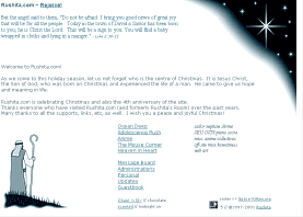 |
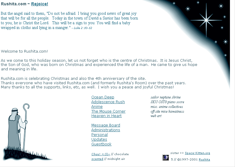
version Rejoice! This
is another quick and simple layout, for Christmas 2001. I simply
had no time to think of a better design, so I just use the clip art from
Corel and slap text right on it. No matter now little time I had,
the Christmas message cannot be excluded. That's the real meaning
of Christmas afterall. This design uses "duotone" effect again which
I think matches winter and the peacefulness of Christmas. From making
this layout, I've learned a new and easy way to convert colour images to
"duotone".
As usual, Christmas layout
cannot be without a Christmas carol. The word "Rejoice!" is clickable
and the midi is "Angels We Have Heard On High". |
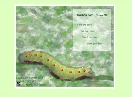 |
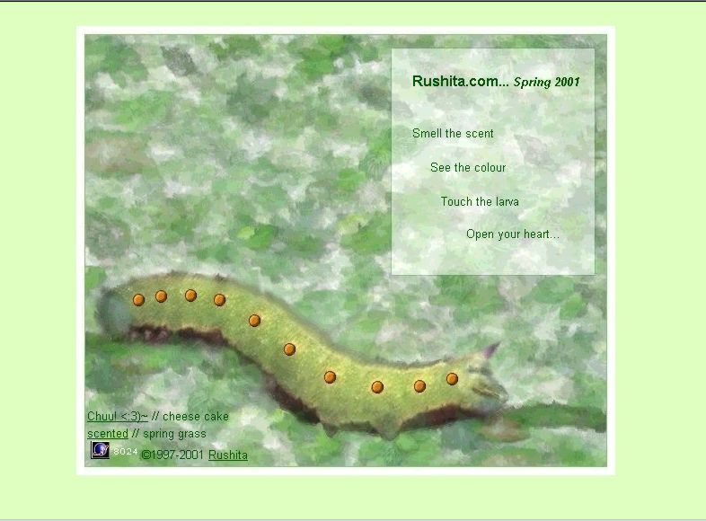
Spring 2001, a very greeny
and springy look. I spent quite a bit of time pondering what I can
do for a fresh spring look. All I could think of were leaves and
a catepillar. So, the catepillar became the focus of the picture.
Like the last version, this one still used hidden "no-text" menu, not to
mess up the nice picture. As some people complained, I hid the menu
too well as well ^^. I knew that would happen so I actually made
bright orange button-like dots on the catepillar's body and I specifically
wrote "touch the lavae". "Smell the scent" was referring to my new
Scented Angel clique. The layout is a very complicated table design
and the picture is actually diced into 27 pieces of irregular sizes to
fit the bright-orange navigation dots. The 404 page and the message
board also have the matching springy layout. |
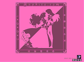 |
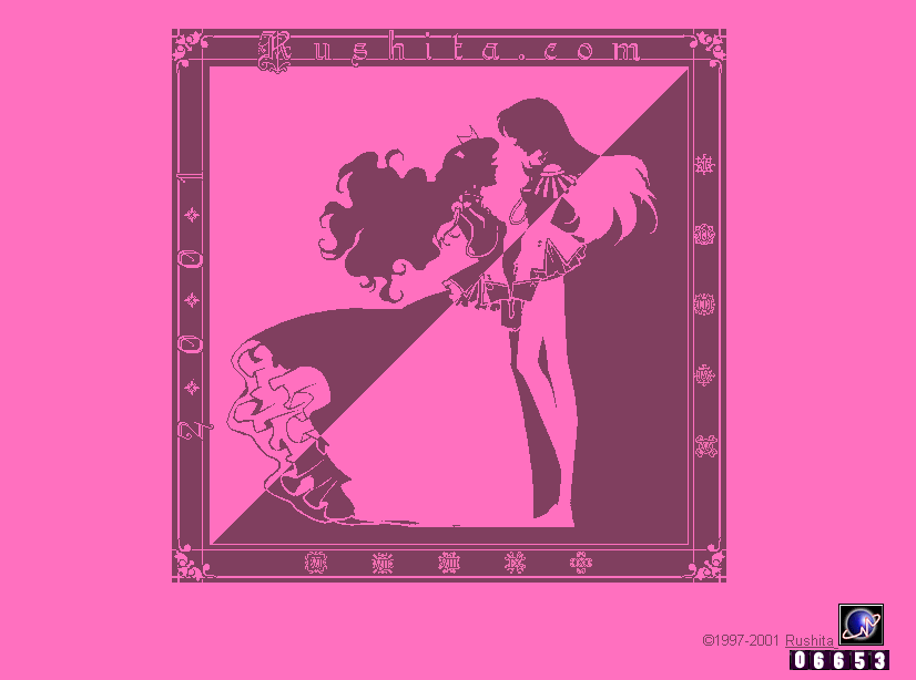
This is the new layout for
year 2001. It is still a Shoujo Kakumei Utena theme. This picture
is played at the ending song of the TV series and I've always wanted it
to be used on my page. Luckily I found a good b/w scan of it.
I'm still interested in "modified monochrome" design and suddenly felt
like to make it "major" pink, just for Utena ^^. This is the first "no-text"
menu, using icon links with only single-word descriptions on the mouseover
effect. The links are on the ornamental design on the right and bottom
border of the theme picture. I found I hid it so well that people
may not be able to find it, so I also made a safety net. The center
picture clickable as well and it leads to the usual intro and tell people
where the links are and how to enter the page, with a touch of SKU style
^^. I've started playing with the palette and this design as an advantage
of fast-loading since each piece of the picture is only 2-bit in color. |
<< Page 1
>> << Page 2 >> << Page
4 >>
|