|
Memories
This is a collection of the
old page layouts I used for Rushita.com (or Rushita's Room) before.
I used to just delete old designs (html files and pictures) from my hard
drive after half a year or so, but I've starting to save them as screen
captures and make a collection of them. That's because I've spend
a lot of effort and time on most layouts and I like every single one I
made. It is such a waste to just trash all the art work. I
only have a few of the more recent ones and those really old ones are already
trashed o.o;; These layouts witness the development of the page and
also the improvement of my html and art skills, and each one tells a different
story... Click on the thumbnails to view the layouts in full-size
(quality reduced from the actual original layouts). They are now
arranged in reverse chronological order.
 |
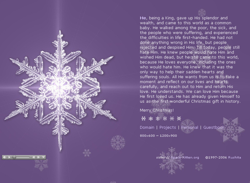
What Child is This? (Christmas 2015)
- This is a come back of the 2012 Christmas layout. The theme about Jesus' birth and death fits the message I want to get across this year. However, the technology changed and HTML 4 has became HTML5, so embedding the Christmas song on the page requires a new method, and midi files no longer works on the new standard. So the instrumental song "What Child is This" is actually an mp3 file, which I stole from a Youtube video. It's such a beautiful piece of music that I can't help using it. If you ever wonder why all my Christmas layouts are put up so late and made or recycled so late, it is due to me being so busy before Christmas every year with a lot of choir practices, and always getting sick at that time of the year. ^^;; |
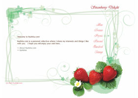 |
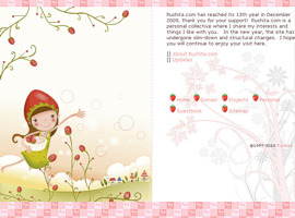
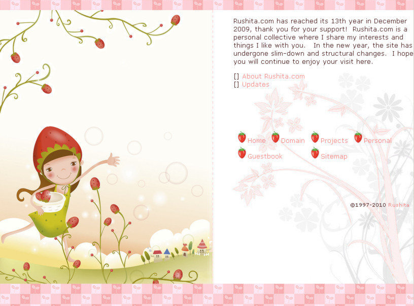
Strawberry Delight - This layout had run for a long time from 2012 to 2015, with Christmas layouts (see below) appeared between years. It's mainly due to the fact I didn't have time to make new layouts. This is actually the first layout after I slimmed down the site. The strawberries look so delicious. It goes so well with the green twirly-whirly floral border underneath it, even though they actually came from different sources. This layout give such a simple and relaxing feel. |
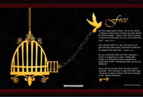 |
Free (Christmas 2013 & 2014)
- This is a design with a bird escaping the bird cage, signaling its freedom. Sometimes we just follow the rules of this world and go after things that everyone goes after, and we feel lost and trapped. Jesus can bring us freedom. By this birth, we find new meaning in life, and real peace. The Christmas song that is embeded on the layout is "Oh, Holy Night!". Like the last Christmas layout, there is a single menu page that has all the link for all sections. You can get to the menu page by clicking on the key. It's like the key to open the cage and you get to walk around the site. The menu page has also the cage them with different bird cages. The error 404 page is also a matching cage theme, symbolizing being trapped in the website not able to go to the page you wanted to ^^;; Thanks to the Way Back Machine, I found out I actually had this layout for 2 Christmas in a row. I guess I like this a lot that I want to use it again (and too busy to make another one). |
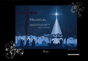 |
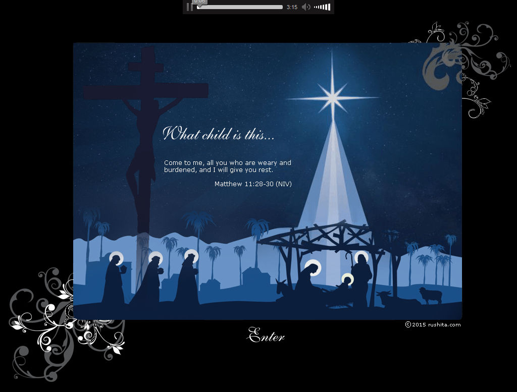
What Child is This? (Christmas 2012)
- This is a combination of traditional Nativity and cruxifixion scenes, and is the heart of Christmas. You can't really talk about Jesus' birth without talking about His death as well. Only by His birth and death, the salvation is complete, and people can lay down their weary and burden and have rest. The song featured is exactly "What Child is This?". This is a new design that doesn't have the navigation menu on the page. When you click on "Enter", you will go to a separate menu page with all the links lead to defferent sections of the site. It just makes thing more simple that way. This is a relatively larger layout design than before. Everyone is using bigger and wider monitor these days, so I'm pretty sure no one would mind. |
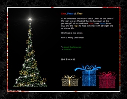 |
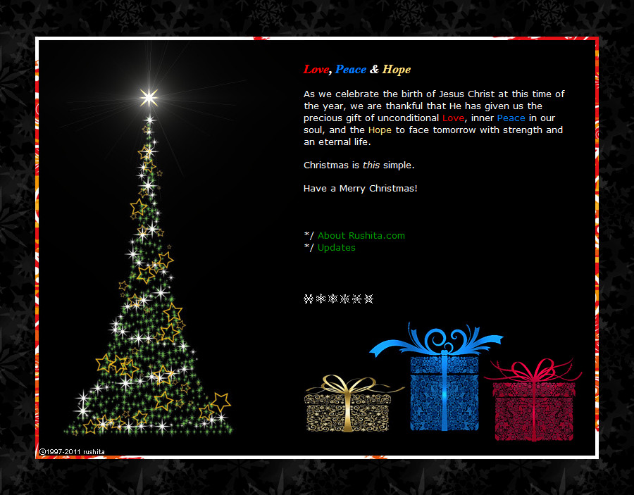
Love, Peace & Hope (Christmas 2011)
- This is a more traditional looking layout with a Christmas tree and Christmas presents, with a snowflake background. The secret is actually on the 3 presents. When you mouse-over the golden present, you'll see a plant seedling and "hope"; if you mouse-over the blue present, you'll see a dove and "peace"; and if you mouse-over the red present, you'll see a heart and "love". These are the presents Jesus gave us by His birth and death, and what we celebrate Christmas for. The song featured is "Angels We Have Heard On High". Once again, the snowflakes icons make for 2006 were reused as navigation menu. They are really useful ^_^. |
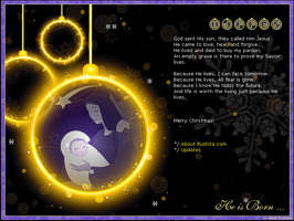 |
He is Born (Christmas 2010)
- This layout features the baby Jesus on a Christmas ornament. It
was first designed for my forum signature image for Christmas, and later
applied to this site. The main message on it was the lyrics of "Because
He Lives". Even though it is not a Christmas song, it brings out
what Christmas really means to us personally. The same snow-falling
effect used in 2008 was applied here as well. The navigation menu
was the ornamental icons on the top right. |
 |
Strawberry - This is a layout
made with real frames. This is probably the first layout I actually
did with frames over 13 years of making the site. Continuing the
cute little girl theme from the previous Christmas layout. This is
actually a very simple layout due to lack of time, however, it still took
me quite a bit of time to get everything to work properly.
This layout ran for a very
long time from March 2010 to November 2011 (and yes, it came out really
late, so we still were using the Christmas one till March! >.>) |
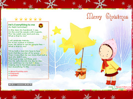 |
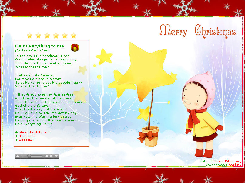
Stars (Christmas 2009) -
This layout is dedicated of my newborn daughter, thus I used a cute girl
wintery image. The main message is the lyrics of "He's Everything
to Me", a Christmas song without the traditional Christmasy tune.
The lyrics already has everything I wanted to share about what Christmas
really is. The midi embeded of course is the music of the same song,
so you could actually sing-a-long. The gift box on the top right
of the lyrics linked to the site called "Jesus is the Gift", which also
aims for the true meaning of Christmas. The hidden mouse-over message
on the little girl is: "My dear daughter, when you grow up, you will understand
Jesus loves you." The navigation menu is the star icons which will
change to orange when they are mouse-overed. |
 |
Christmas 2008 - This layout
is a modification of the non-Christmas version of Duet of Love during the
Christmas period. The snow-falling effect is added with a javascript,
using the hand-drawn snowflakes images made for the layout of Christmas
2006. The midi is "Angles We Have Heard On High", matching the Christmas
message: "Glory to God in the highest, and on earth peace to men on whom
his favor rests." |
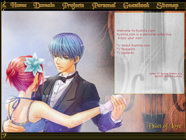 |
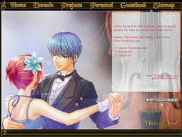
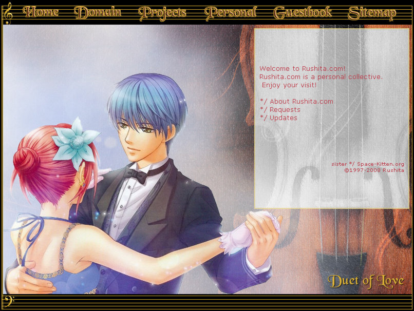
Duet of Love - This is a
La Corda D'oro theme with my favourite violin couple Hino Kahoko and Tsukimori
Len. The name "Duet of Love" is came from their heart-warming violin
duet of Ave Maria. The nagivation is self-explanatory, clearly marked
on the music scored design. The mouse cursor image is Lili, the Fata
(musical fairy). The hidden mouse-over message is "Him...", "Her...",
"together their hearts soar." The accompanied 404 layout was the
image of the Kahoko's broken violin. I love this layout very much.
This layout was up for a
full year from November 2008 until November 2009. |
<< Page 2
>> << Page 3 >> << Page
4 >>
|


